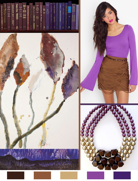
This week’s color palette has some back story, and is the basis of a long-running argument between myself and my dear friend, Thomas. It all boils down to a response he made many years ago, regarding a color combination I sported one day in high school. He declared that purple and brown absolutely do not make a legitimate color combination, which of course defies all of my color-loving logic. To this day we agree to disagree, but I’m the textile designer, and he flies jets for a living.
Color
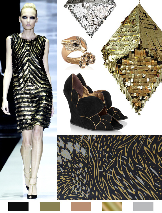
Why don’t we take it in a formal direction this week with a shiny palette of mixed metallics and black.
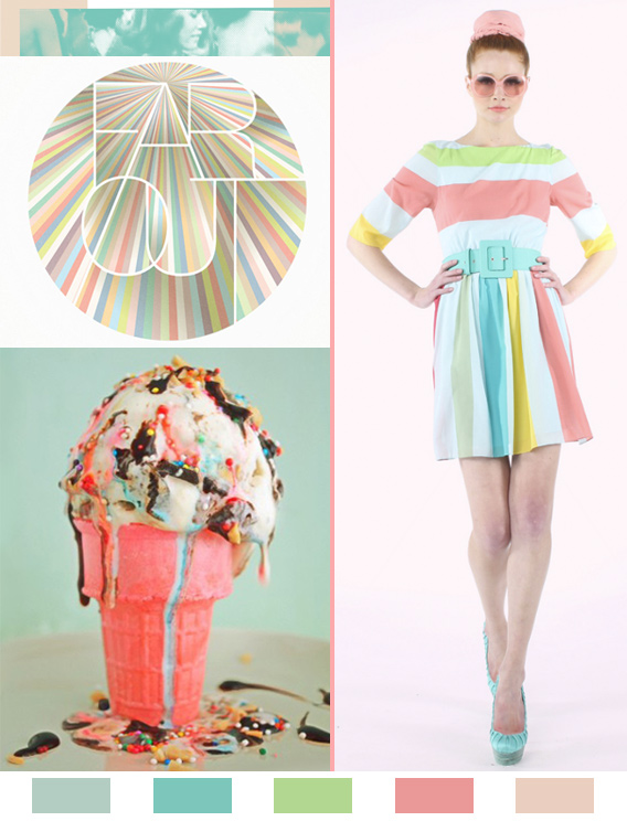
It’s Spring time in a different part of the world, and this week’s color story is in their honor. This whole arrangement is putting me in a Beach Boys kind of mood. Hope you’re starting off to a great week!
Picture an overgrown, mossy forest in the mist, and you’ll probably need to borrow a few colors from the below mood board. Earthy greens and browns with a hint of dusty lavender; we approve this palette for pretty much any season of the year.
This palette is inspired by the striking colors found in Christian Siriano’s Spring ’12 collection; peach and chartreuse. It’s such a fresh and unexpected combination of hues.


