One quirky print trend that caught our attention from the Resort 2014 runway shows was the use of typography. Often executed in black and white for a more optical effect, we see how various compositions create positive and negative space, accentuating both geometric and organic shapes found in the letters and numbers.
Costume National, Sportmax, and Moschino Cheap And Chic all via Style.com
Background print © Aaryn West
Bold, simplified prints are making their back into the runway scene in several of the Resort 2014 collections with these Mod Geos. Get graphic with basic shapes; squares, circles and polygons will be your best friends with this vintage print trend.
(more…)
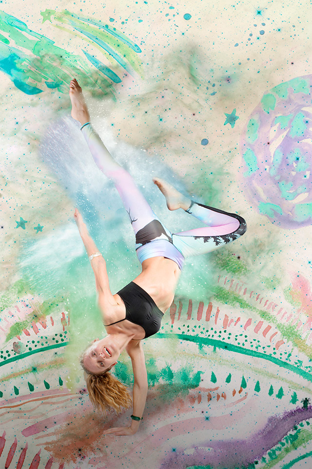
I was recently approached by fair-fashion maven Rachel of the blog My Fair Vanity to collaborate on a little project of hers. She teamed up with Teeki, a graphic yoga wear company that is not only made in the USA, but whose luscious fabrics are also constructed from recycled plastic water bottles (genius, right?). In an effort to promote Teeki’s campaign of launching their other-worldly designs into space [yes, you read that correctly], Rachel has coordinated a talented team to create a set of accompanying promotional images.
The spaced-out result features a handful of gorgeous dancers from Washington D.C.’s Capitol Movement, modeling their favorite Teeki gear, shot by Jason Hornick Photography, all set against some Aaryn West dreamscapes.
The deadline for Teeki’s space mission may have passed, but be sure to check out their website to find out more about their earth-friendly process and shop their awesome collection of super soft leggings and tops. And if you’re not already following Rachel at My Fair Vanity do yourself a huge favor and hop to it. She’ll make you feel a lot better about your never-ending quest for retail therapy with all sorts of locally made and sustainable insights.


(more…)
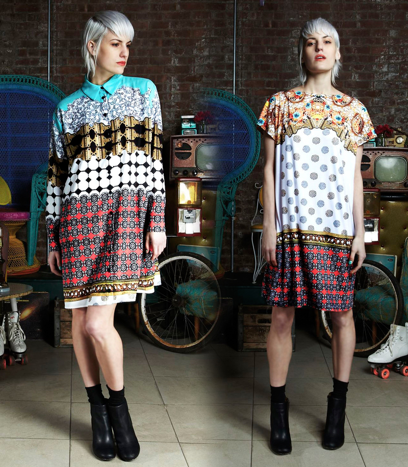
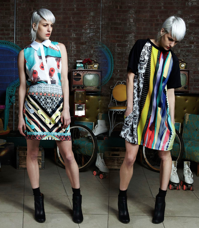
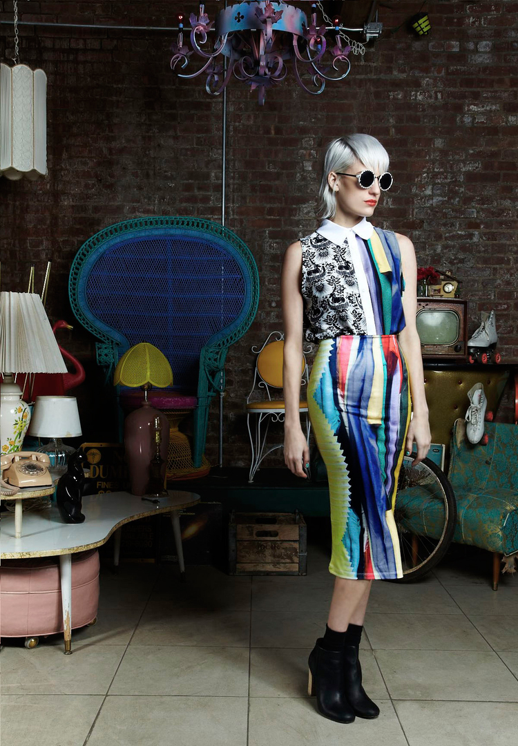
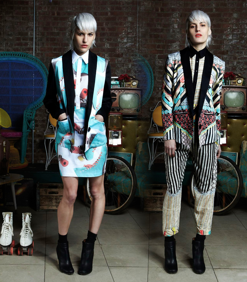
We recently came across How Very Dare, a Brooklyn-based fashion label with a penchant for innovative, photo-centric digital prints. Their newest collection, Trash to Treasure, doesn’t officially launch until tomorrow, but we caught a sneak peek on Relapse Magazine’s blog and had to share. We are loving the kitschy imagery and carefully engineered mixing of prints, which underscore one of our favorite design mantras: More is More.
For more news and info about How Very Dare, check out their website, or follow them on Facebook and Twitter. If you’re anywhere near Brooklyn, be sure to check out the collection in person this weekend at their pop up shop at Alter.


(more…)
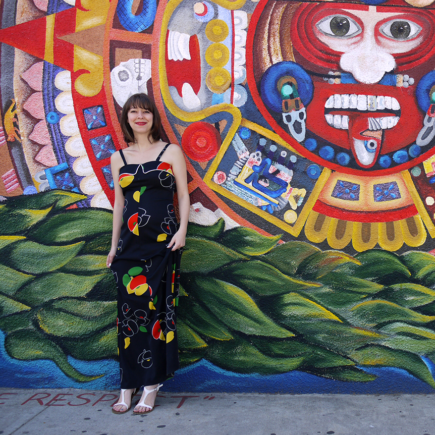
I nearly freaked out when I discovered this giant mural in the Highland Park area of Los Angeles, which was so large and varied that I may come back for another shoot later in this photo series. The Aztec calendar portion was the perfect compliment to the primary colors in my vintage dress, don’t you think?
Come back next week for an update in our ongoing series: Patterns, Preggos & Painted Places.

(more…)


