There were some really consistent color trends throughout the Resort 2013 collections, which have conveniently been rounded up below into five easy palettes. A few honorable mentions would be the classic nautical red-white-and-blue combo, as well as a quirky mix of mismatched purples somewhat reminiscent of the elderly lady you sometimes see at the grocery store. I know you know what I’m talking about.
Fashion
If you’re picking a destination for your 2013 Resort holiday, I highly suggest you follow the lead of these designers and take a trip back in time. Somewhere in the 60’s-70’s would be my choice. Vintage prints, colors and silhouettes are front and center in so many Resort collections that it had to be my first print report of the season. Below are a few of my favorite looks in this trend; I’m particularly loving the ones with bright, contrasting colors!
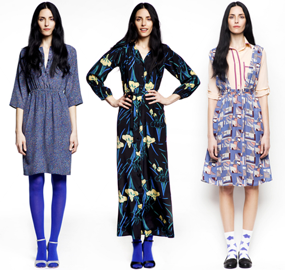
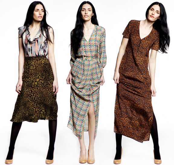
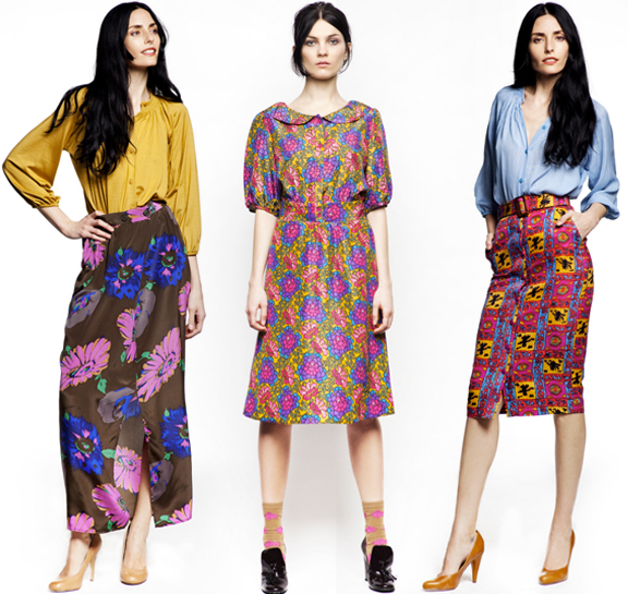
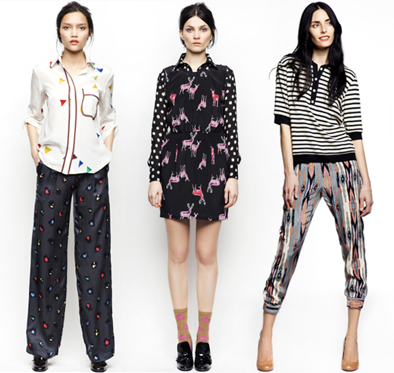
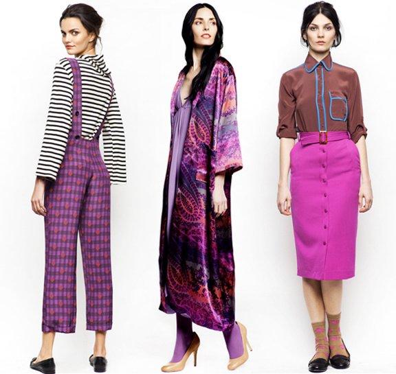
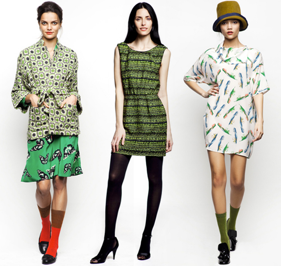
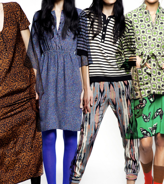
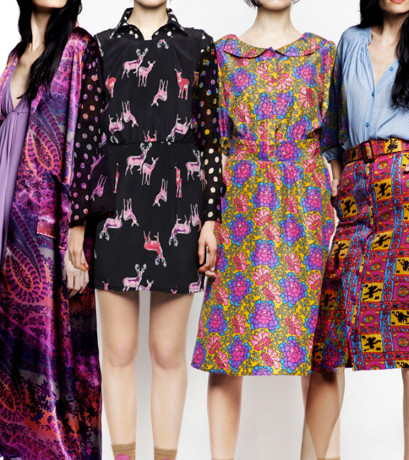
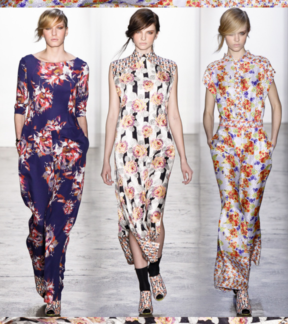
If you are a vintage print junkie then you might want to call your sponsor because you are going to want to overdose on Tucker‘s fall 2012 collection. I mean, wow. With a total of 84 unique looks to drool over, it was a little difficult picking my favorites. Riddled with retro looking geos and florals, cute conversationals, and even a dash of leopard; this collection really has it all.
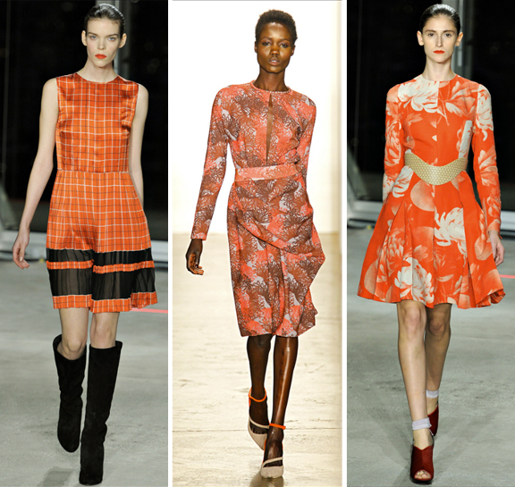
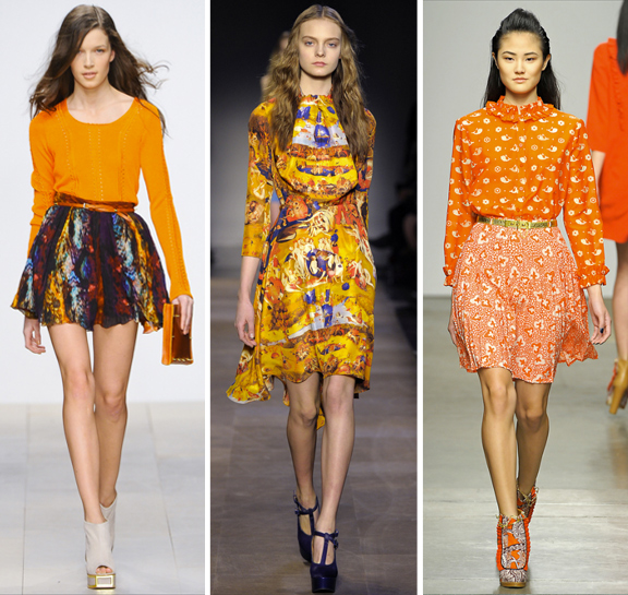
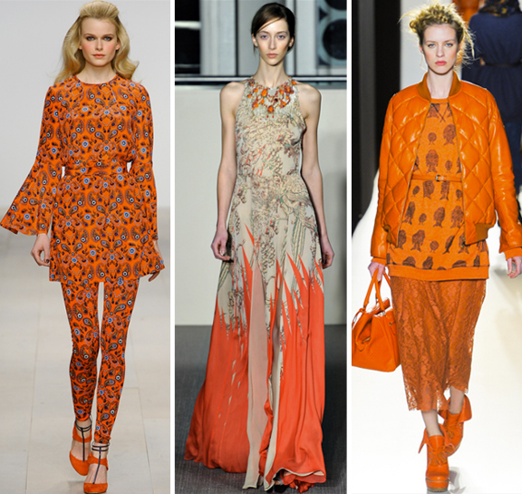
A round up of our favorite prints in the most publicized color of the year: Tangerine Tango. It’s not a bad representation of the season’s top print trends, either… from florals, plaids, and paisleys all the way to Hieronymous Bosch!
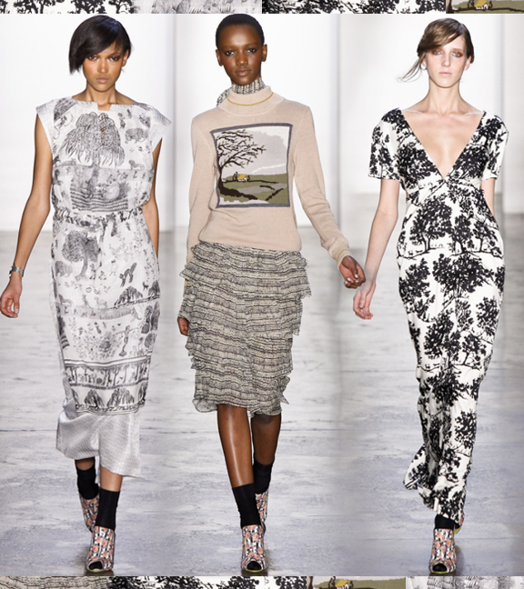
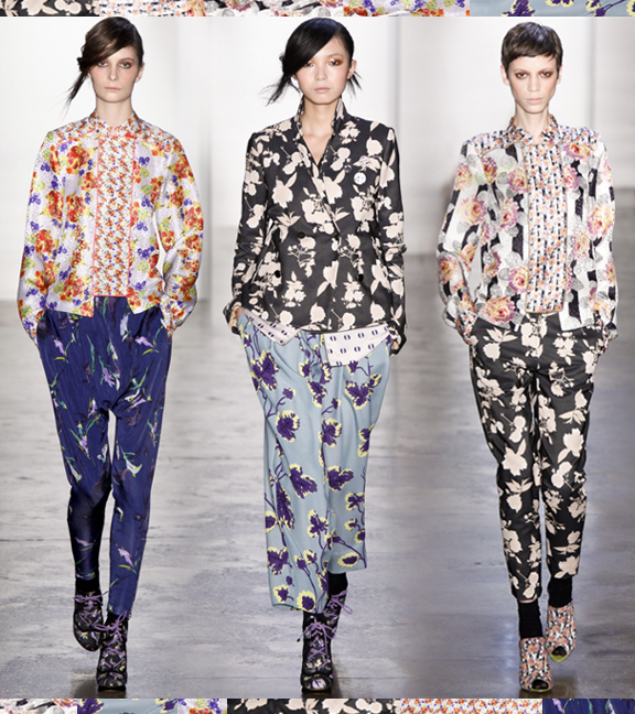
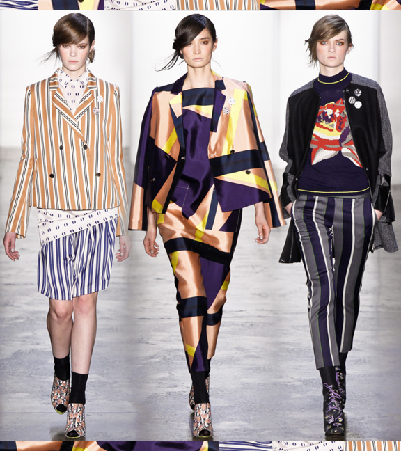
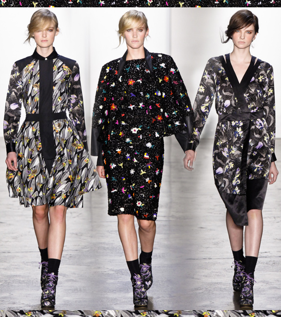
Just when I thought this fall might bring a shift towards minimalism as designers {potentially} grow weary of prints, Suno saves the day. There are so many print themes to love in this collection, from the chic neutral countryside, to the new classic; the printed LBD. Am I nutty to think there’s a little something here for everyone? What do you think?


