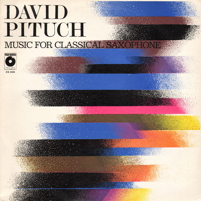
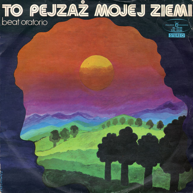
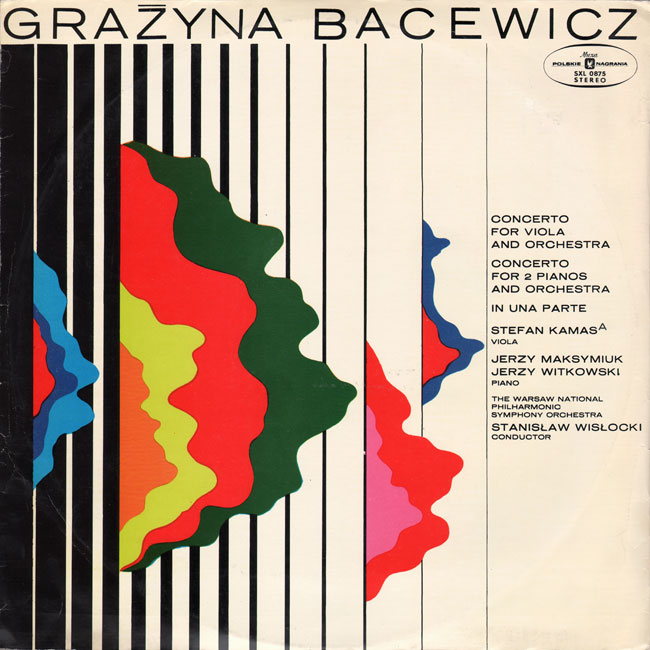
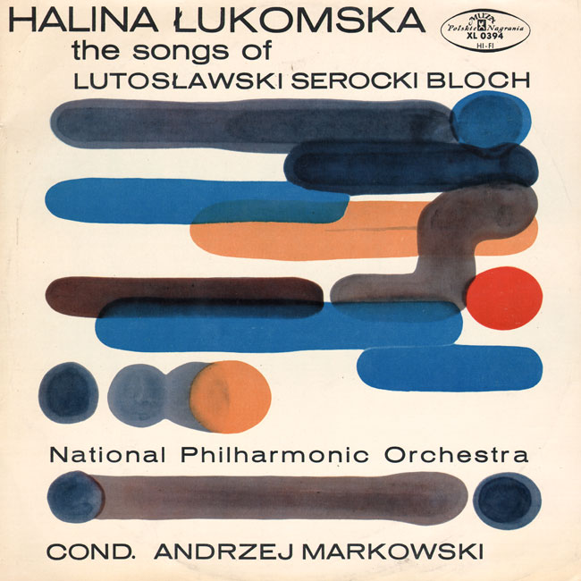
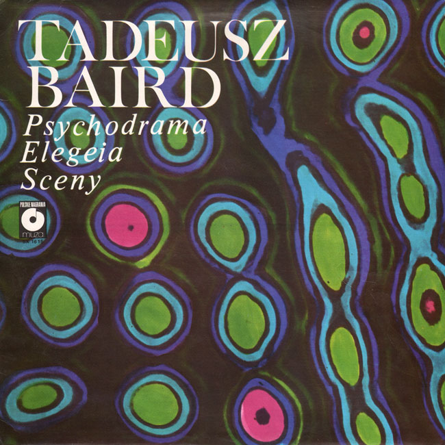
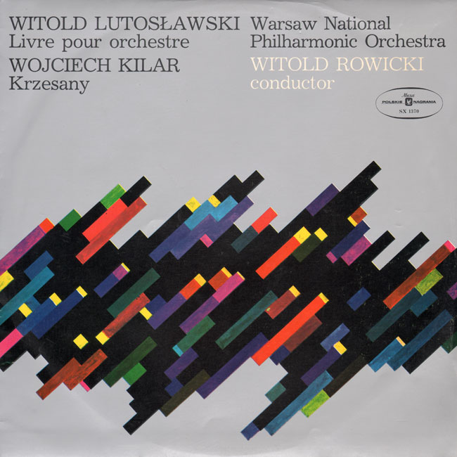
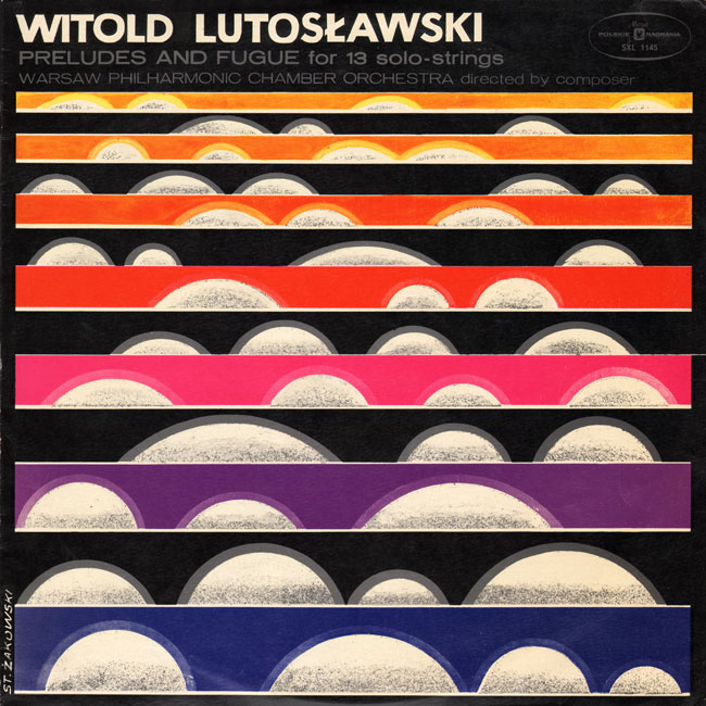
I have no clue what the music sounds like, but these vintage Polish album covers I discovered on 50 Watts are totally groovy. Created in the first half of the 20th century, I love the juxtaposition of abstract art paired with classical music. How amazing would it be to stumble across one of these puppies at a yard sale? See even more over at the original post.
50 Watts
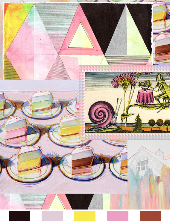
This may be our most mouth-watering color inspiration yet! It’s got me craving a table full of multicolored meringues. That would be a suitable breakfast any day of the week.
This week’s color palette has some back story, and is the basis of a long-running argument between myself and my dear friend, Thomas. It all boils down to a response he made many years ago, regarding a color combination I sported one day in high school. He declared that purple and brown absolutely do not make a legitimate color combination, which of course defies all of my color-loving logic. To this day we agree to disagree, but I’m the textile designer, and he flies jets for a living.
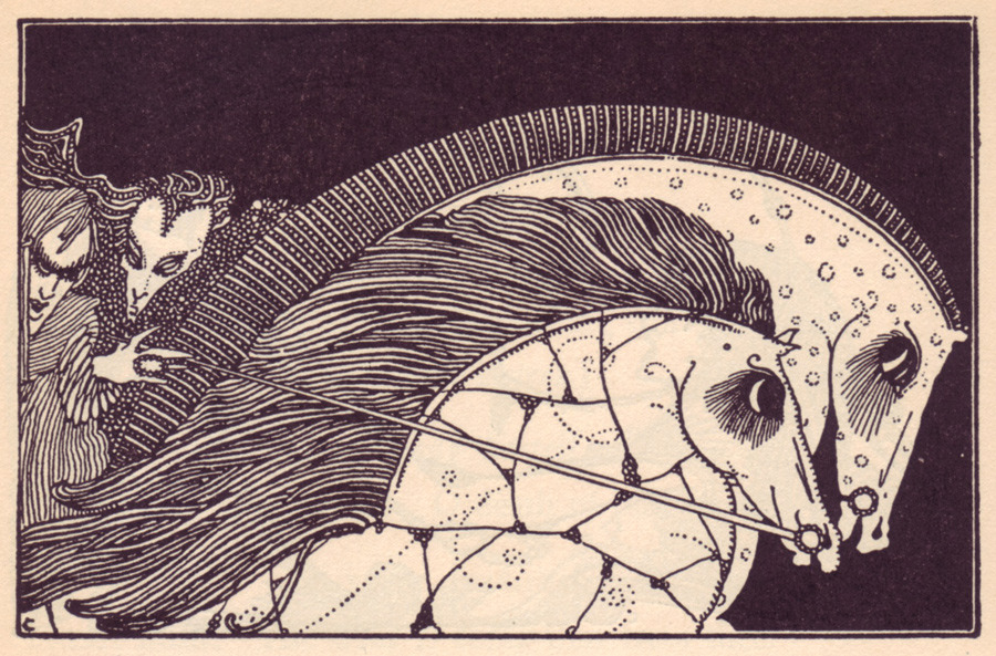
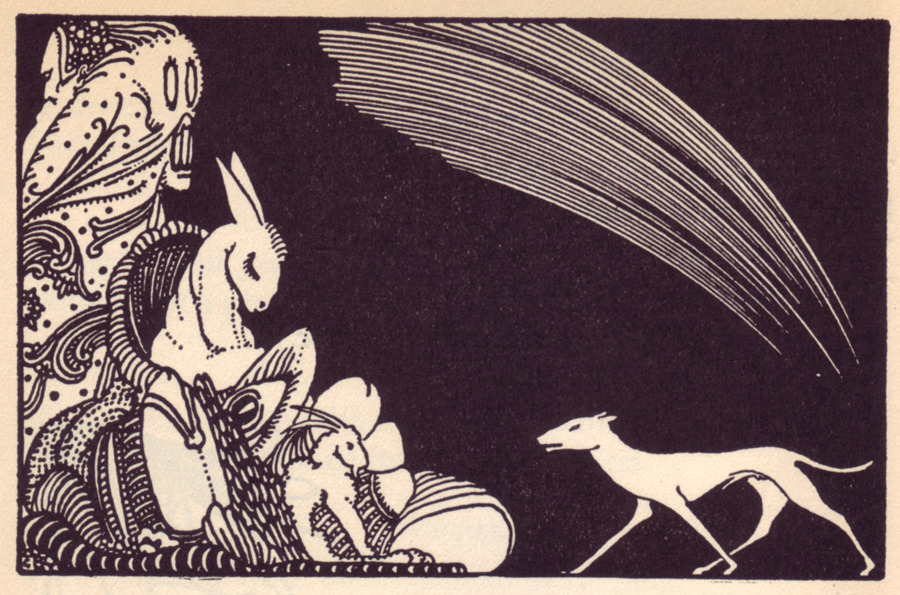
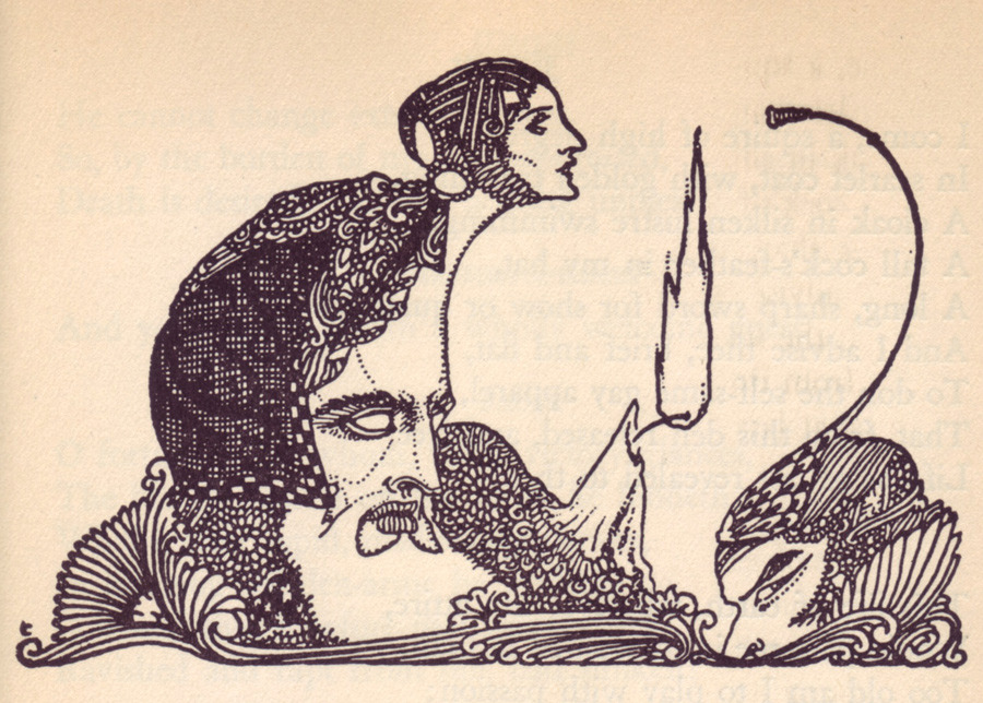
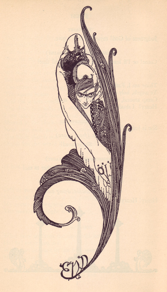
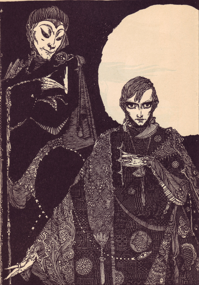
When I came across this set of illustrations on 50 Watts I was instantly attracted and had to double check the name behind the penmanship. They are by a fellow named Harry Clarke and were created for for a 1925 edition of Goethe’s Faust, but the style reminds me of Aubrey Beardsley’s work, of which I am a fan. I even have this print of his, framed in my bedroom. That could be why I am loving the below images by Mr. Clarke. The organic lines and intricate detail he put into his work is incredible. I particularly love the contrast between geometric and organic ornamentation in the very last image posted below. A little creepy, yes I’ll give you that. Perhaps I should have saved this post for the end of October?

