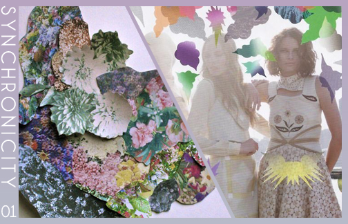
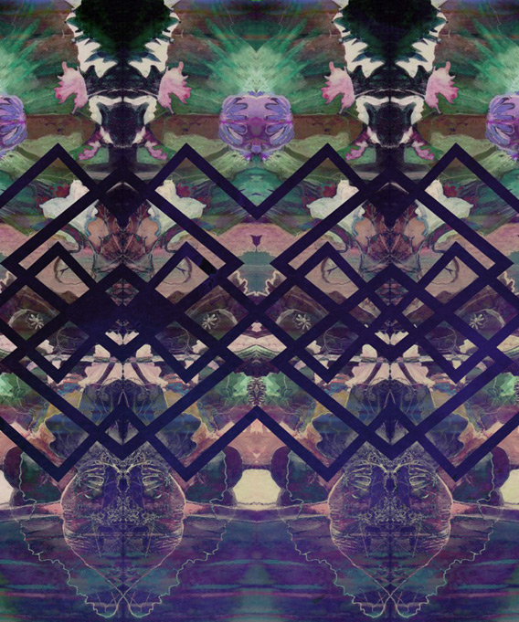
Today we bring you the final installation in our highlight of Resort 2015 runway print trends, which centers around the cut paper collages we’ve been seeing more and more of over the past few months. It’s a fantastic way to mix prints and show off your knowledge of other popular textile trends; think of it as the crazier version of the Block Party trend we highlighted last week. If this look is to over-the-top for your client base, simplify it by using prints with a smaller scale, and limiting the number of colors used in the overall design. For more examples of how to approach this collage inspired print concept, be sure to check out our pinterest board!
Cut25 by Yigal Azrouël, Kenzo, Erdem all via Style.com
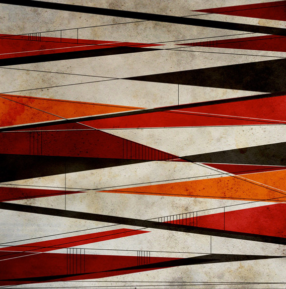
Background print © Aaryn West
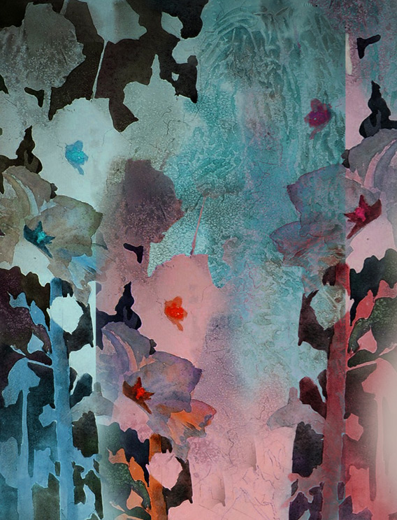
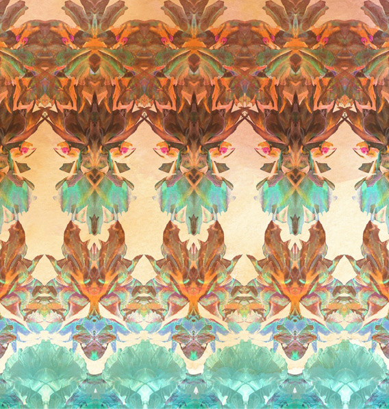
In my never-ending quest for visual inspiration, it’s fairly astonishing how often I come across seemingly unrelated images that share an uncanny relationship, somehow overlapping in concept or execution. So often, in fact, that I’m starting a new weekly segment called Synchronicity. Hope you all enjoy!

(more…)
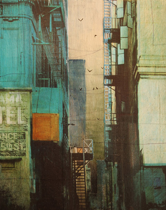
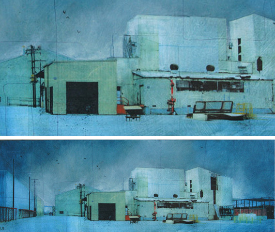
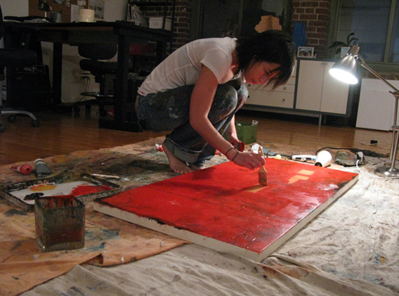
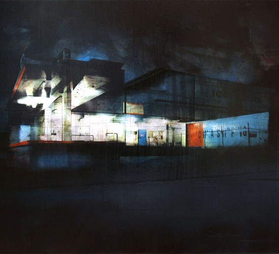
If you like to overdose on color and texture (and of course I do), then I’m excited to introduce you to Liz Brizzi, a textile and fine artist living and working in Los Angeles. I love her colorful multimedia paintings depicting gritty urban landscapes, they have a quiet solitude I don’t normally associate with cities like Los Angeles. It’s as if she’s redefining the well-manicured iconography this city is typically known for. And while you can’t find many of her textile designs on her Etsy page, they are equally stunning. Her artwork is so layered and complex, and the colors are so bold and yet effortless all at once. In a nutshell, I am madly in love with her style. Be sure to read on to see her answers to our six little questions.


AW: Where do you like to find inspiration?
LB: Well I have to say that I find inspiration in places where most people wouldn’t venture. The grittier and more remote, the better. Sometimes I just go drive around in the suburbs and most industrial areas of Los Angeles with my camera and just start shooting. I’ll take hundreds of photos on those safaris of mine. Sometimes people think I’m really weird… “Why is she taking pictures of this old decrepit warehouse?”. Ha! I guess I see beauty where most people wouldn’t.
AW: Describe your style in three words.
LB: Gritty. Colorful. Desolate.
AW: Do you have a favorite theme or medium you like to follow within your personal work?
LB: My medium is always the same. It’s a mix of photography printed on paper and collaged onto canvas or wood panels within layers of acrylic paint. The theme is urban, city landscapes. Some are more realistic than others. I either paint a straight up “portrait landscape”, or create a more abstract alternate reality by collaging together pieces and architectural details from several different photographs.
AW: If you could choose any designer or artist to collaborate with, who would it be and why?
LB: One one of my favorite artists right now is Ian Francis. I just love the way his paintings are partly super detailed and refined, and partly loose and sketchy. I want to try and incorporate some of that into my own art.
AW: What do you like to do to unwind when you need a break from work?
LB: Well, between my fine art and working on textile prints, when I finally have time to myself, I like to do things that are completely non-creative! Like hanging out with friends, watching movies, and also cooking. Even though you could say that cooking can be creative. But there is something really relaxing to me about following a recipe and not working with any fancy technology like computers, cameras etc… Just me and my wood spoon.
AW: If you won the lottery today, would your job, your art, or the process you use change in any way?
LB: I would probably get the most expensive tools ever, which would allow me to work in HUGE format. That could be interesting. But to be totally honest… if I win the lottery, something tells me I would be too busy traveling the world and not working. :)


(more…)

