While lace isn’t traditionally a print trend per se, it would be remiss to overlook it as a potential goldmine when considering which Spring 2015 trends to design into. White was such an important color for this season, and quite honestly, one that we tend to overlook. But when designers find ways to embellish the simple white dress into such mesmerizingly beautiful frocks, we notice. Once again, there were so many examples to consider for this board that it was nearly impossible to narrow down our favorites! Be sure to review Marchesa, Alberta Ferretti, Blumarine, and Julien Macdonald for more inspiration on this ornate trend.
Ermanno Scervino, Roberto Cavalli, Tibi all via Style.com
Background print © Aaryn West
One of our absolute favorite eras in textile design turned out to be a major theme on the runway this season; the groovin’ 60s and 70s. Today we’re featuring quirky geos that would give any Mod a good flashback. For additional examples of this hip trend, check out collections from Trina Turk and Orla Kiely.
Isa Arfen, dsquared2, Libertine all via Style.com
Background print © Aaryn West
We start our extensive review of Spring 2015 runway print trends with a sweet take on the traditional spring floral. Infused with light and a touch of blur, these airy ombre fades add just enough of a modern twist to a look that never goes out of style. Be sure to check out the new collections from Carolina Herrera and Monique Lhuillier for additional examples of how to approach this trend.
Naeem Khan, Blumarine, Badgley Mischka all via Style.com
Background print © Aaryn West
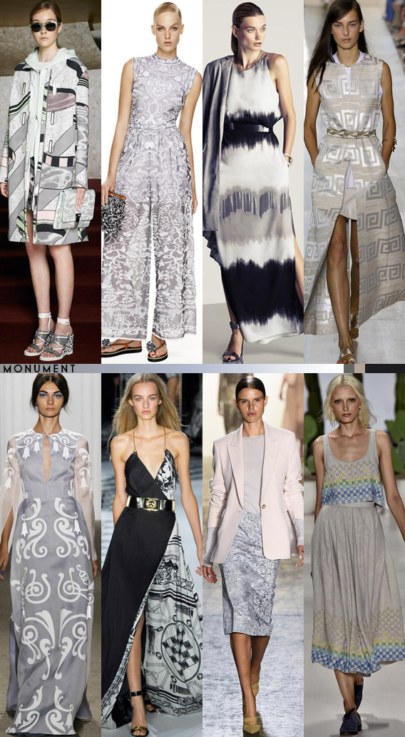
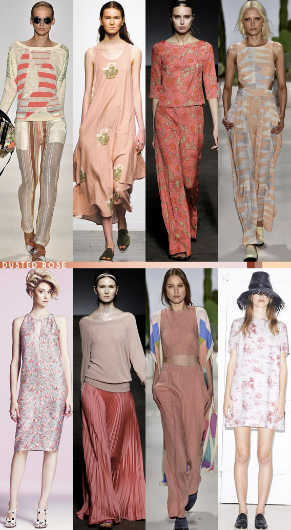
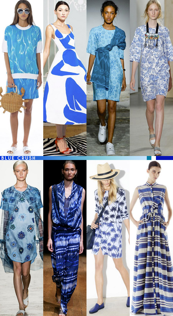
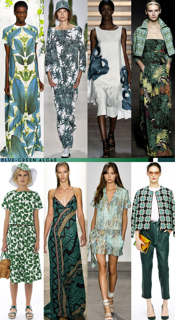
New York Fashion week is in full swing, and although there are plenty of shows (and several other cities) remaining, a few key color palettes are becoming rather evident. If you actually look back at the Resort 2015 color stories, you’ll find that Spring colors have not drastically changed from the previous season. Blue and yellow are both quite strong on their own, if not a bit softer this time around. Orange is quite the pop color, which you’ll find in shades from peach to rust. Although they didn’t make it into this particular color roundup, it’s worth mentioning that pastels were represented in large numbers (especially baby blue), as well as high-contrast prints in black and white.

Opening Ceremony, M Missoni, Halston Heritage, Tory Burch, Honor, Versus Versace, Wes Gordon, Mara Hoffman

Coach, Carolina Herrera, Diane von Furstenberg, Escada, Tanya Taylor, Alice + Olivia, Giulietta, Nanette Lepore

Custo Barcelona, Creatures of Comfort, Tracy Reese, Mara Hoffman, Lyn Devon, Mara Hoffman, Band of Outsiders

Kate Spade New York, Alice + Olivia, Baja East, Creatures of the Wind, Otswald Helgason, Josie Natori, Tomas Maier, Novis

Kaelen, Mara Hoffman, Tibi, Tracy Reese, Kate Spade New York, Sophie Theallet, Nonoo, J. Crew
Ocean Sunset: Kate Spade New York, Honor, Mara Hoffman, Novis, Trina Turk, Whit, Vivienne Tam, Suno
All images via Style.com
One quirky print trend that caught our attention from the Resort 2014 runway shows was the use of typography. Often executed in black and white for a more optical effect, we see how various compositions create positive and negative space, accentuating both geometric and organic shapes found in the letters and numbers.
Costume National, Sportmax, and Moschino Cheap And Chic all via Style.com
Background print © Aaryn West

