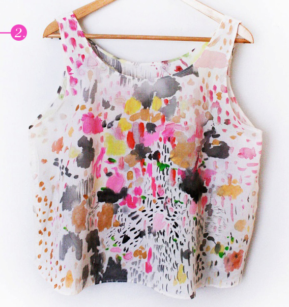
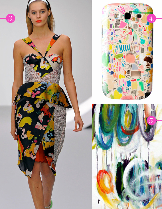
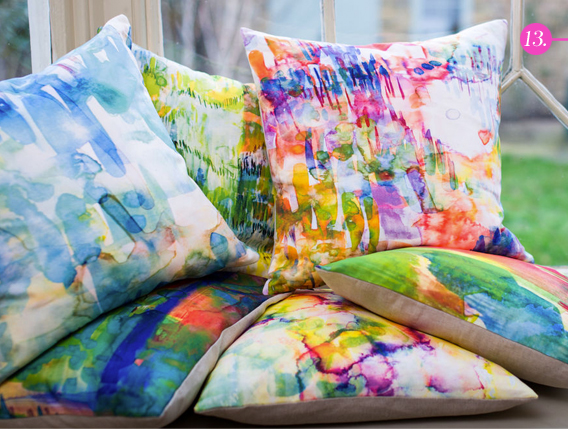
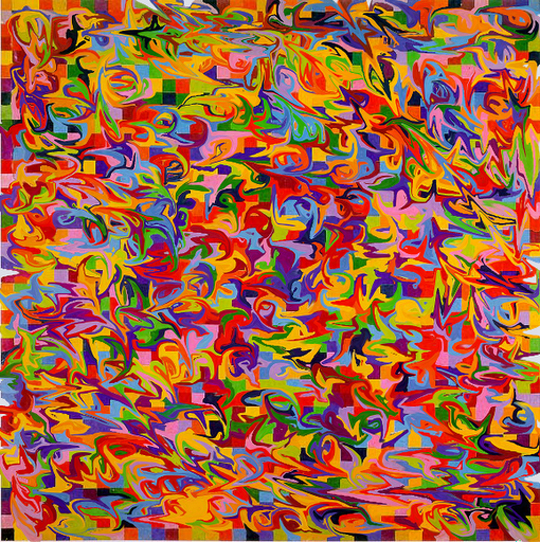
Moving right along in our series of posts highlighting the most important Resort 2015 runway trends, we have abstract, painterly brush stroke prints. Keeping the color palette minimal or subdued will give designs a more sophisticated feel to an otherwise youthful and chaotic trend.
Piazza Sempione, Barbara Bui, Prabal Gurung all via Style.com
Background print © Aaryn West
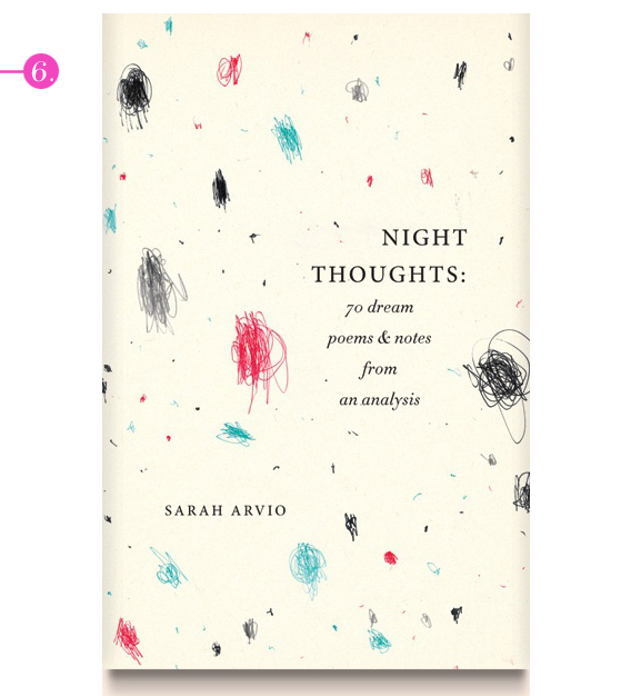
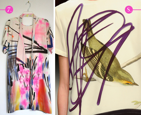
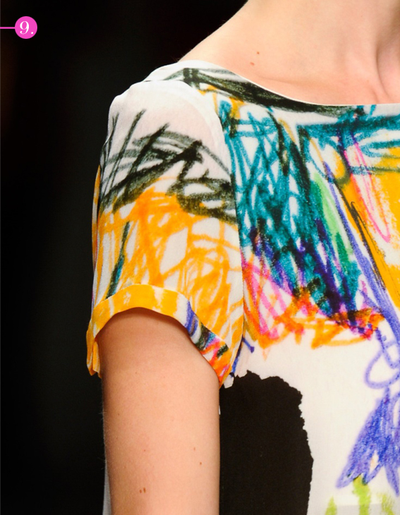
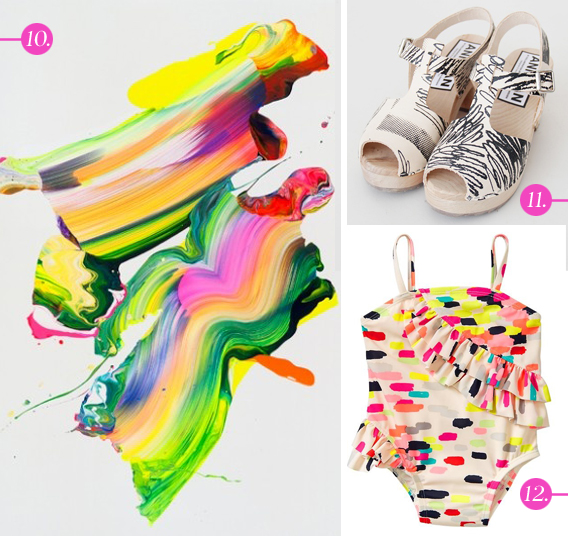
Today we’re turning the spotlight on a print trend we’ve been seeing a lot of lately, and one that we’re completely bonkers for: scribble art. Inspired by the free-form musings of fine artists like Cy Twombly, scribble prints are an explosion of color and texture. This spring we’ve spotted this trend on everything from the runway to shoes, and even book covers. Here’s a collection of some of our favorite examples from around the web.


(more…)
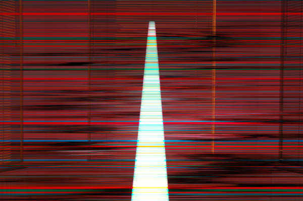
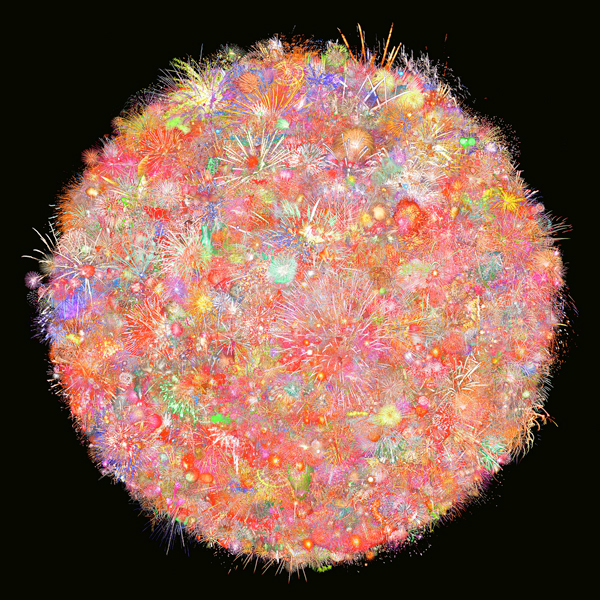
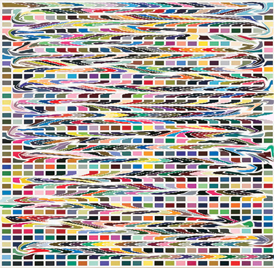
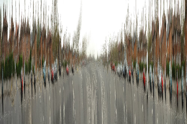
I had the pleasure of meeting Hyo Myoung Kim several years ago, as he and my husband were once students of photography together in London. Even then his work had a heavy lean toward the digital, but it’s been incredible to see his art evolve over time, focusing even more heavily on digital mediums and a fascination with color. One of his most simple-looking pieces, 1001 Nights, is actually 1001 night photographs superimposed together, blending to create one single image. On the more detailed end of things you have collections like Fingered and Nightmare for Malevitch 36000, which remind me of the beautiful digital chaos that designers like Basso & Brooke are so famous for.
We asked Hyo Myoung if he would spare a few minutes to open up with us by answering the six questions we like to ask artists, and he graciously complied. Check out our interview with him below, and be sure to head over to his portfolio to a ton of other work, including this gem just for any literary nerds out there.


Aaryn West: Where do you like to find inspiration?
Hyo Myoung Kim: Looking at a lot of images in relation to the work I am making, e.g., Google image search results.
AW: Describe your style in three words.
HMK: Repetition, difference and randomness.
AW: Do you have a favorite medium or theme you like to follow within your personal work?
HMK: Instead of flying cars and manned space exploration, I only see iterations of the future as possible outcomes of the proverbial dices thrown by the networked reality, structured by the internet, based on the building blocks of text, image, video and sound. This is in the back of my mind.
AW: If you could choose any designer or artist to collaborate with, who would it be and why?
HMK: Mark Neveldine & Brian Taylor, the directors of the Crank series and Gamer. There is so much care-free visual energy in their films. The clash of their style and my style would create something more nauseatingly energetic.
AW: What do you like to do to unwind when you need a break from work?
HMK: Walk by the stream near home, away from the computer. {map provided!}
AW: If you won the lottery today, would your job, your art, or the process you use change in any way?
HMK: This question gives me instant thoughts on a shopping list for a larger-scale art production:
– Thompson’s Viper FilmStream Camera ($170,000)
Michael Mann used this Digital HD camera to shoot Miami Vice. It has very good low light performance. It changed the shooting habit for low light action.
– Render farm for 3D rendering (Approx. $100,000 worth of equipment to start with)
Rendering on one computer takes days and weeks. I want instant render results for rapid production.
– Space for render farm computers (Varies: $200,000)
I wouldn’t want to stay near the hot and noisy computers.
– Very good all-round programmer/software engineer (Salary: $50,000)
This person will make my ideas happen, and I won’t have to search for solutions online.
– Color 3D printer (something like ZPrinter 850. $ 50,000?)
Go all out, print 3D things.


(more…)
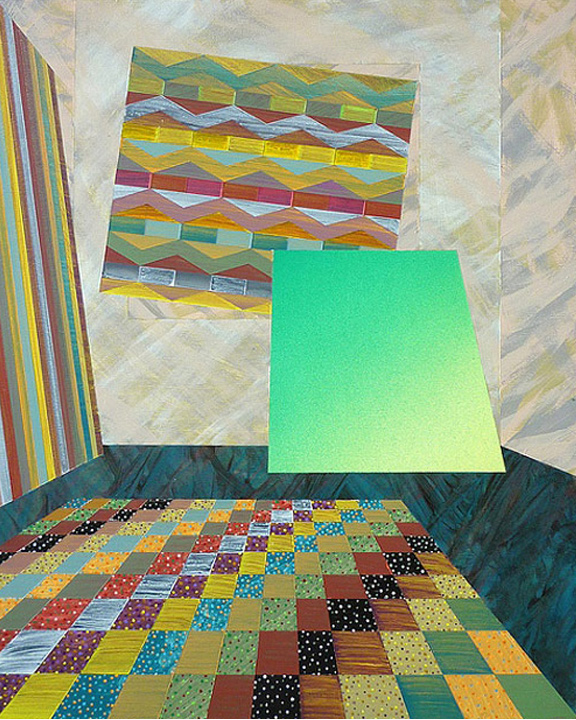
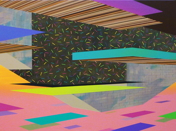
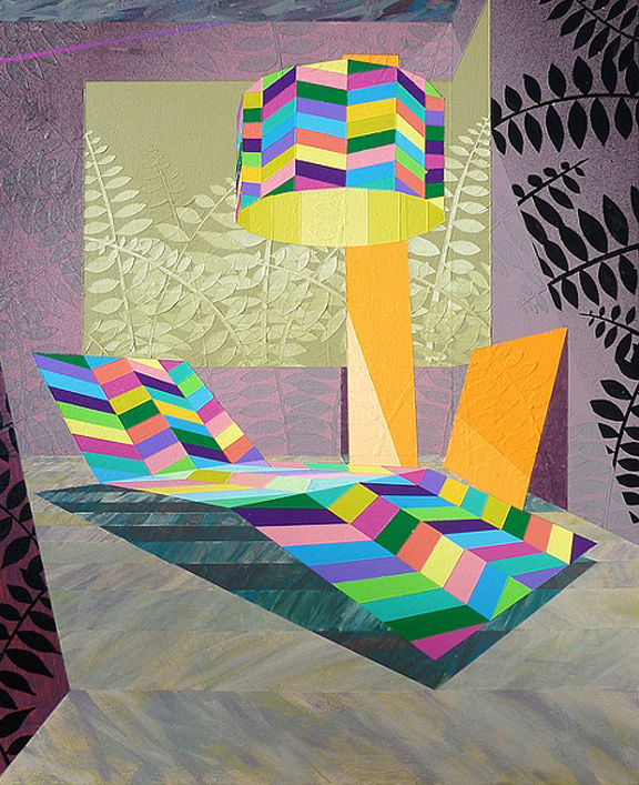
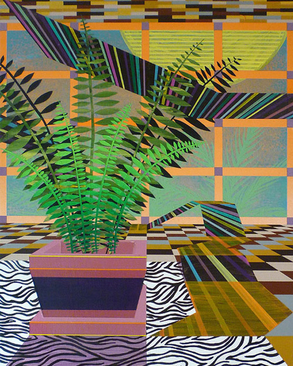
A shout out to Booooooom for featuring an artist that really floats my boat, Michael Dotson. His paintings abound with bright, contrasting colors, geo shapes, print mixing, texture for days – and all presented in a semi-surreal, retro manner. That’s pretty much a recipe for awesome, right? Check out his website to see more of his work!


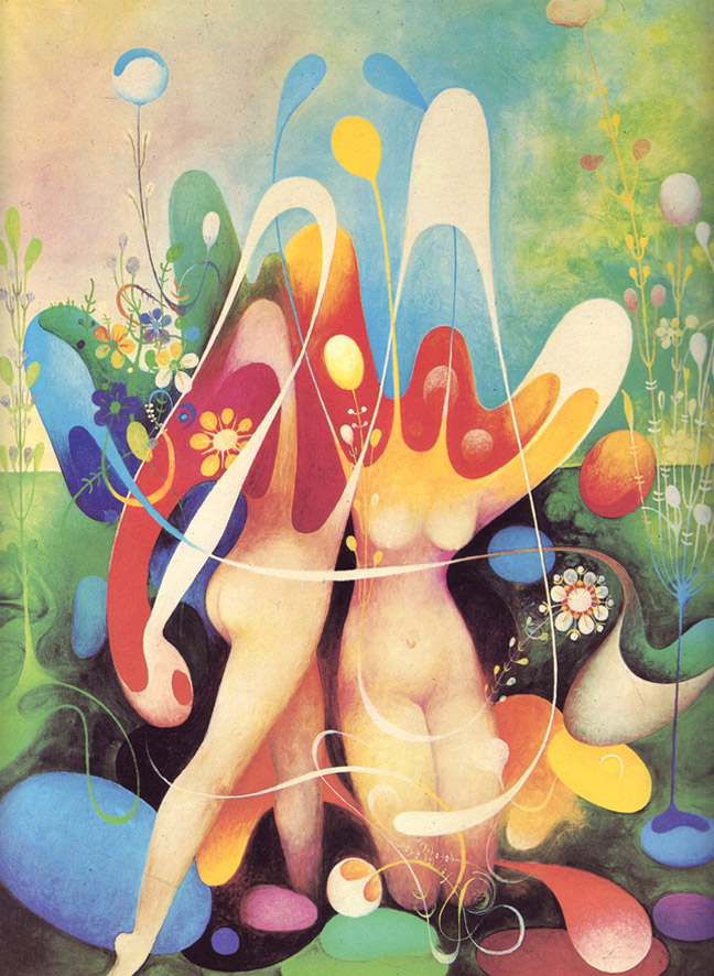
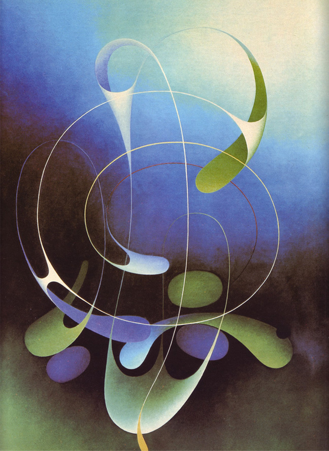
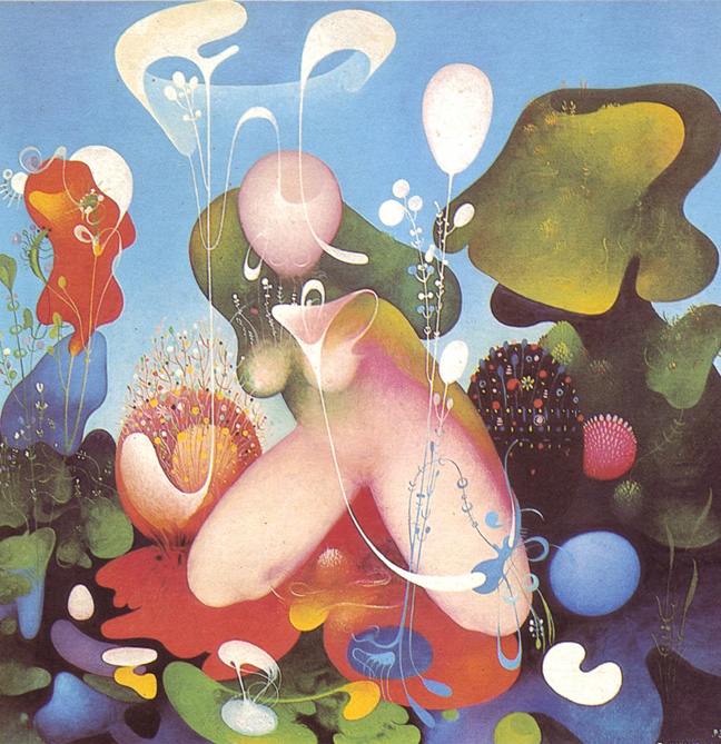
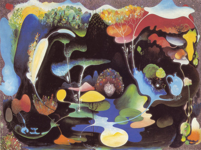
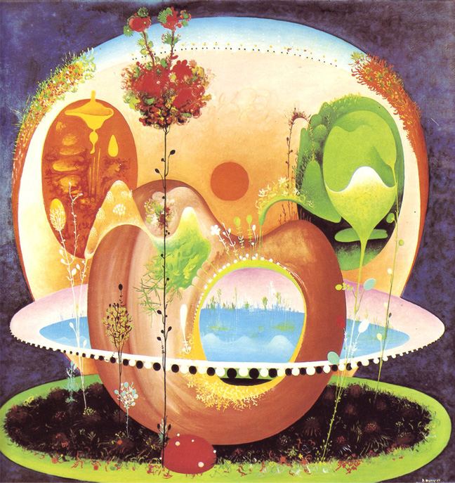
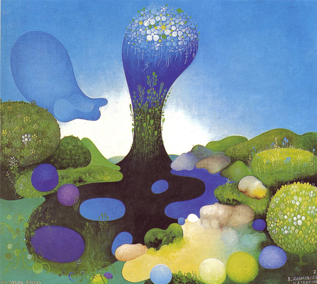
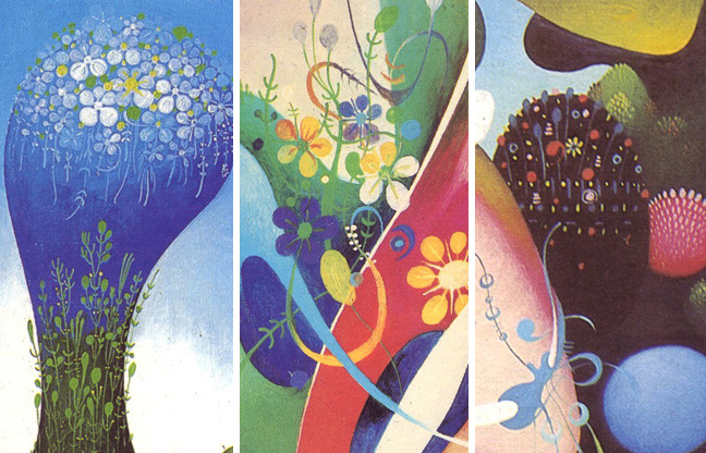
As a textile designer, I have a special appreciation for Vangel Naumovski (1924-2006), a surrealist painter originally hailing from Yugoslavia. The fine, floral detail and his use of color and shading really draw me in, and I see countless individual print motifs within each of his paintings. I also see the influence of my favorite Renaissance painter, Hieronymus Bosch.. interestingly enough, if you read the original post over at 50Watts, you’ll see Bosch mentioned among Naumovski’s influences, along with likes of Kandinsky, Klee, Ernst. As a fan of psychedelic art in general, I would say his gooey, organic shapes and bright, floral details certainly do not disappoint.


(more…)

