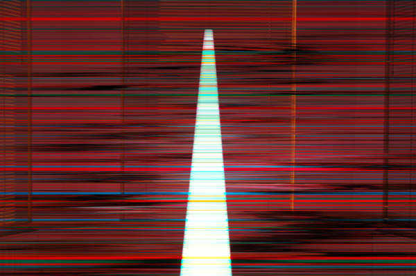
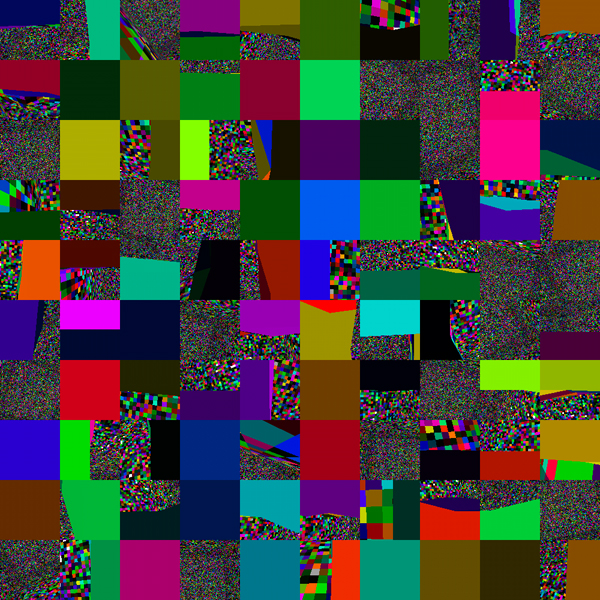
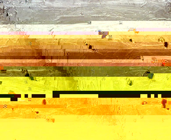
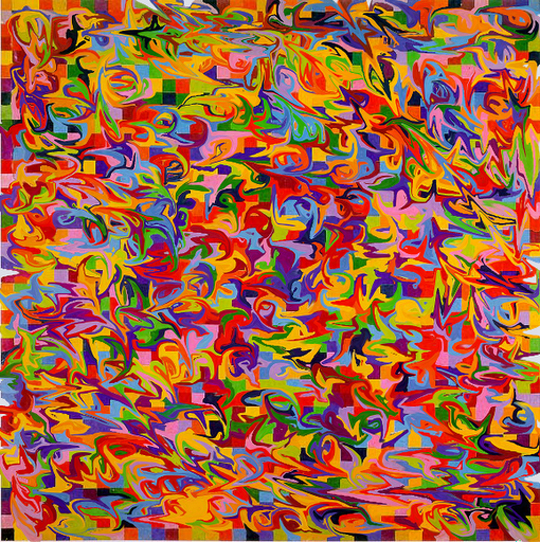
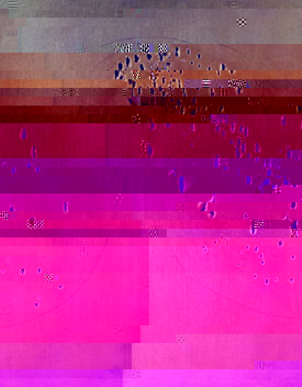
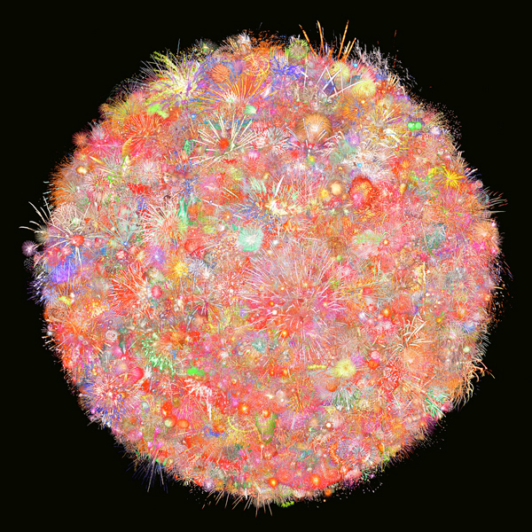
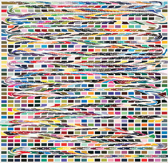
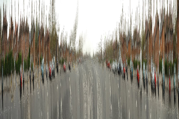
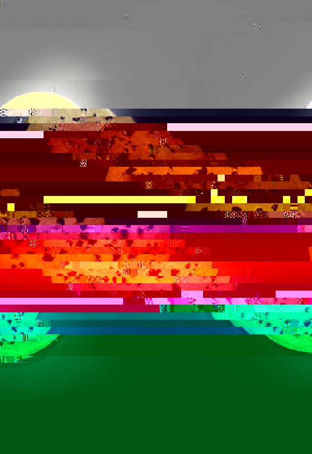
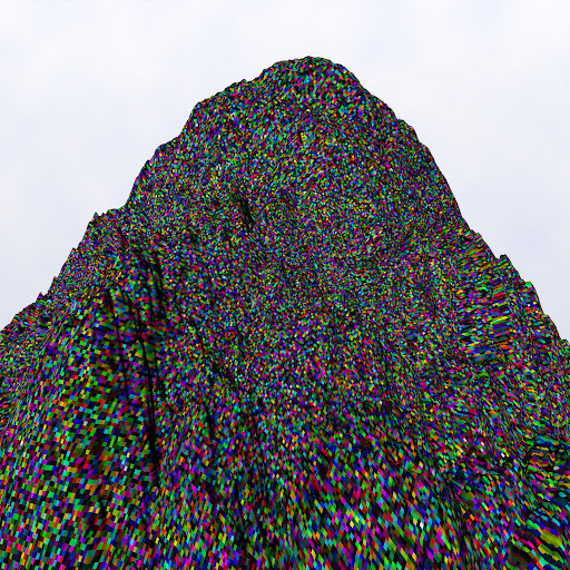
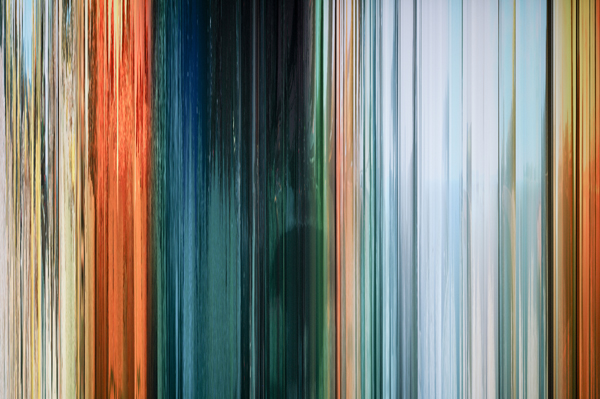
I had the pleasure of meeting Hyo Myoung Kim several years ago, as he and my husband were once students of photography together in London. Even then his work had a heavy lean toward the digital, but it’s been incredible to see his art evolve over time, focusing even more heavily on digital mediums and a fascination with color. One of his most simple-looking pieces, 1001 Nights, is actually 1001 night photographs superimposed together, blending to create one single image. On the more detailed end of things you have collections like Fingered and Nightmare for Malevitch 36000, which remind me of the beautiful digital chaos that designers like Basso & Brooke are so famous for.
We asked Hyo Myoung if he would spare a few minutes to open up with us by answering the six questions we like to ask artists, and he graciously complied. Check out our interview with him below, and be sure to head over to his portfolio to a ton of other work, including this gem just for any literary nerds out there.


Aaryn West: Where do you like to find inspiration?
Hyo Myoung Kim: Looking at a lot of images in relation to the work I am making, e.g., Google image search results.
AW: Describe your style in three words.
HMK: Repetition, difference and randomness.
AW: Do you have a favorite medium or theme you like to follow within your personal work?
HMK: Instead of flying cars and manned space exploration, I only see iterations of the future as possible outcomes of the proverbial dices thrown by the networked reality, structured by the internet, based on the building blocks of text, image, video and sound. This is in the back of my mind.
AW: If you could choose any designer or artist to collaborate with, who would it be and why?
HMK: Mark Neveldine & Brian Taylor, the directors of the Crank series and Gamer. There is so much care-free visual energy in their films. The clash of their style and my style would create something more nauseatingly energetic.
AW: What do you like to do to unwind when you need a break from work?
HMK: Walk by the stream near home, away from the computer. {map provided!}
AW: If you won the lottery today, would your job, your art, or the process you use change in any way?
HMK: This question gives me instant thoughts on a shopping list for a larger-scale art production:
– Thompson’s Viper FilmStream Camera ($170,000)
Michael Mann used this Digital HD camera to shoot Miami Vice. It has very good low light performance. It changed the shooting habit for low light action.
– Render farm for 3D rendering (Approx. $100,000 worth of equipment to start with)
Rendering on one computer takes days and weeks. I want instant render results for rapid production.
– Space for render farm computers (Varies: $200,000)
I wouldn’t want to stay near the hot and noisy computers.
– Very good all-round programmer/software engineer (Salary: $50,000)
This person will make my ideas happen, and I won’t have to search for solutions online.
– Color 3D printer (something like ZPrinter 850. $ 50,000?)
Go all out, print 3D things.


(more…)
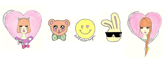
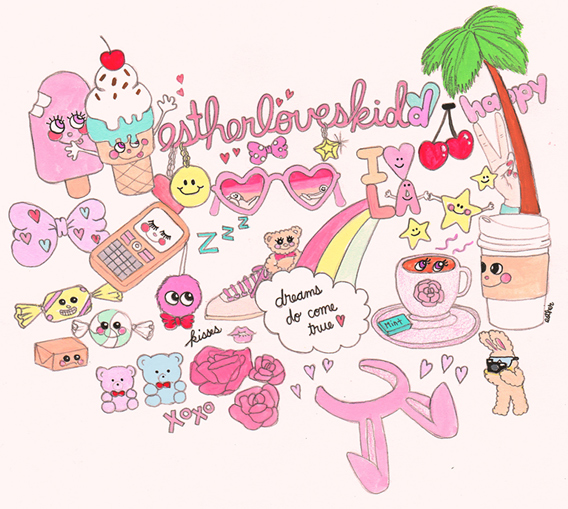
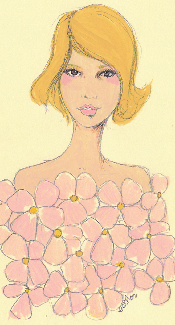
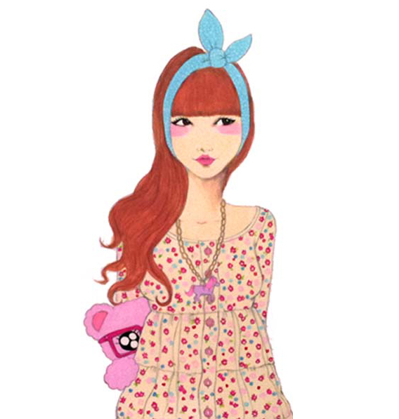
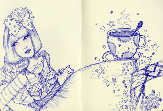
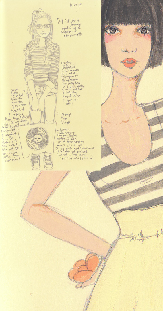
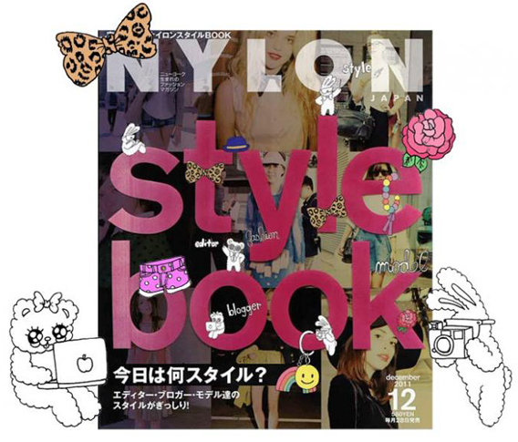
Nearly two years ago I had the pleasure of crossing paths with the next artist in our interview series, the talented Esther Kim. Although she would never tell you this, she’s a bit of an international superstar… Born in Los Angeles, she spent her teenage years in Tokyo, which begins to explain some of the influence behind her uber-cute, nostalgic style. She’s best known for her fashionable illustrations of super pretty girls, and also the whimsical, huggable characters that often accompany them. It kind of makes me think: part Lisa Frank, part Sanrio, with a touch of vintage Barbie (please forgive my incessant need to classify everything). Her client list is enviable, including the likes of Anna Sui, Nylon (Japan, Korea and US), Elle Girl Korea, Kid Robot, and Urban Outfitters, to name a few. She is currently working on a digital art project for Sony Plastation, and you can even find her art on the cover of Nylon Japan’s December ’11 issue!! Be sure to visit her website after reading the full interview below!


AW: Where do you like to find inspiration?
Esther Kim: Daily life, fashionable girls and laughter… My inspiration comes from a deep desire to express what I see around me. When I catch something that I want to record/keep by drawing I am excited. It can be anything but I’m inspired by change, by shifts in myself through the things around me, which can easily be seen in fashion and of course, of course things that are super girly: french actresses, from the 60‘s, Tokyo street fashion, palm trees, Los Angeles sunsets, eye-shopping at Parco, k-pop stars….
AW: Describe your style in three words.
Esther Kim: Girly. Lovely. Sweet. (A little bit cool?)
AW: Do you have a favorite theme you like to follow within your personal work?
EK: I guess I am obsessed with drawing girls. I love fashion, especially street fashion. I like how you can see visual changes in culture through the personal choices people make in what they wear.
AW: If you could choose any designer or artist to collaborate with, who would it be and why?
Esther Kim: It was my dream, dream, dream to work with Nagi Noda. I am sad that she passed away. I’ve always loved all the work she did for Laforet…oh yeah, I would love to work with Laforet Harajuku! and other artists. I want to collaborate with photographers and other illustrators, too.
AW: What do you like to do to unwind when you need a break from work?
Esther Kim: I love to read!!! I love Russian writers. Tolstoy is one of my favorites~! Working my way through War and Peace. I also started reading The Hunger Games series which is really addictive.
AW: If you won the lottery today, would your job, your art, or the process you use change in any way?
Esther Kim: Hmmm, I would rent a studio, for sure, and buy lots of canvases and learn to paint properly.


(more…)
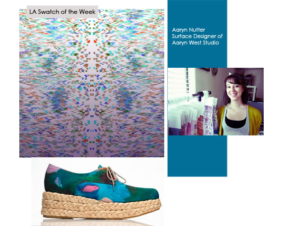
Last month I was delighted to meet Nalini Arora, a blogger and freelance shoe designer going by the name of LA Shoegirl. Well today I’m even more delighted to have her feature an Aaryn West print as her swatch of the week, posted along with a mini Q&A session with me. Be sure to check out her blog for the full post and interview! A big thanks to Nalini, and stay tuned for a possible future collaboration!

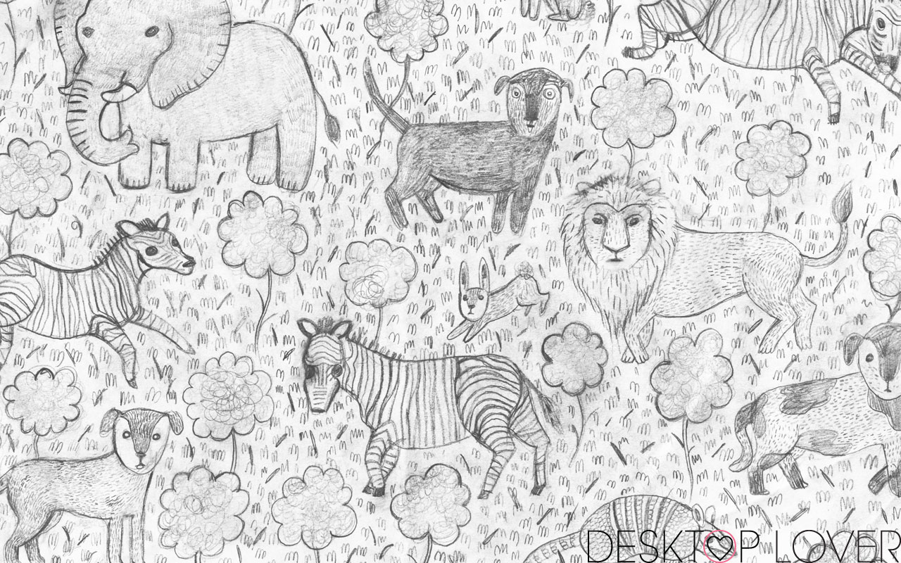
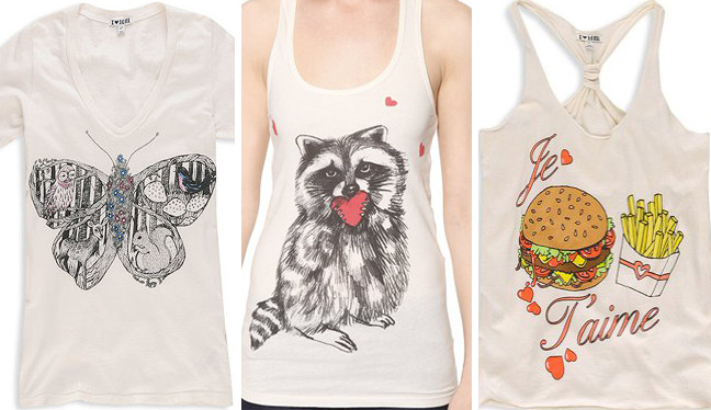
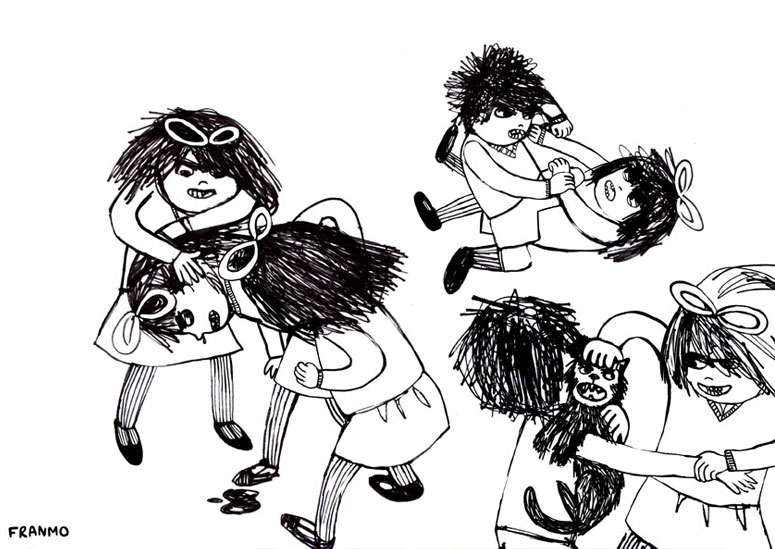
Although you may not know her personally, there’s a decent chance you’ve seen the illustrations of Francesca Boyd-Barrett, a.k.a. Franmo. A native to Mother England, she now lives and works in sunny Los Angeles. By day she’s an Art Director for a tee shirt company, and over the last several years she has seen her designs printed on countless tees sold at retailers like Urban Outfitters, Delia’s, and F21, to name a few. Seriously, girlfriend has done a lot of tee shirts. In her spare time she continues her craft through collaborations and personal work, and has devoted special attention to her pet project, Desktop Lover. It’s a great site where you can browse really cute desktop wallpapers for a variety of screen sizes, and download any of them completely for free! Did you hear that? Free surface design! Check it out and test one of those bad boys on your desktop – that is, as soon as you’re done reading Francesca’s hilarious interview below. Scroll down, there’s more!


AW: Where do you like to find inspiration?
Franmo: Nature is inspiring. I go hiking a lot which clears my head and chills me out.
I’ve always loved fashion from every era including current trends and I’m heavily into that.
I also spend a lot of time on blogs which is a pretty extraordinary source for inspiration. Although the internet is awesome it isn’t as all-encompassing and exciting as getting out in the real world.
AW: Describe your style in three words.
Franmo: Quirky. Scruffy. Weird.
AW: Do you have a favorite theme you like to follow within your personal work?
Franmo: I love funny and silly art that doesn’t take itself too seriously. I love comic style art also, simply because I don’t have the patience for that shit and I’m in awe. David Shirgley is pretty awesome in every way. I love Will Sweeney‘s attention to detail and Neckface because of his drawing style and fucked up nature of his art in general. There are many other artists I love also but I don’t really have one favorite in particular.
AW: If you could choose any designer or artist to collaborate with, who would it be and why?
Franmo: Fuck I really don’t know. I would love to collaborate with anyone who is super talented but who’s style is completely different from my own. Those are the best collaborations I think because the results are exciting and unexpected.
Collaborating with a fashion or shoe designer would be kinda rad. In my day job, I’m an Art Director / designer, for a t-shirt company, and it never gets old seeing your art as a wearable piece.
AW: What do you like to do to unwind when you need a break from work?
Franmo: I’ve been getting into movie and TV show watching. I never really was a TV person and I”m feeling a bit like a couch potato these days, but it’s fun. I love Dexter. Who doesn’t though?!
Again, getting out into nature is also something great for unwinding which I do almost every day. Squirrels make me laugh. They make strange noises too.
AW: If you won the lottery today, would your job, your art, or the process you use change in any way?
Franmo: I’d probably spend about one month shopping for clothes and shoes. Lame I know, but it’s true. Then I’d get bored, so maybe I’d go to some exotic country and explore. Then I would come back and live like a trust-fund baby in an overpriced loft somewhere, painting and getting high all day. Seriously though, I would really love to get an MFA in art or illustration. I would probably write and illustrate children’s books, not caring whether or not they got published. Maybe I’d work towards getting a solo show so I can drink free wine. The possibilities are endless.
AW: Indeed, Franmo, indeed they are.


(more…)
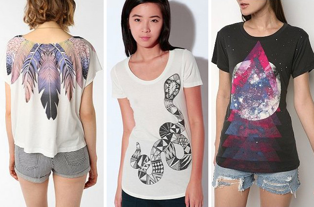
Today we’re kicking off a new blog column where we interview rising artists, designers and small companies, getting to know them a little better. We’re starting with one of our absolute favorite clothing labels, WkShp.
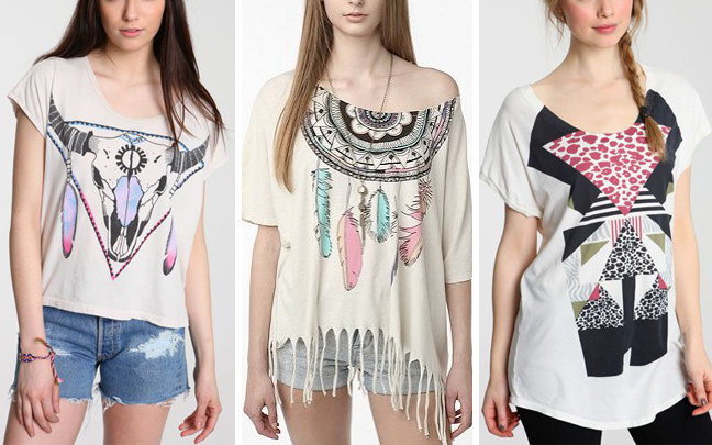
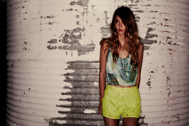
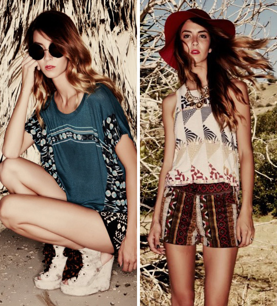
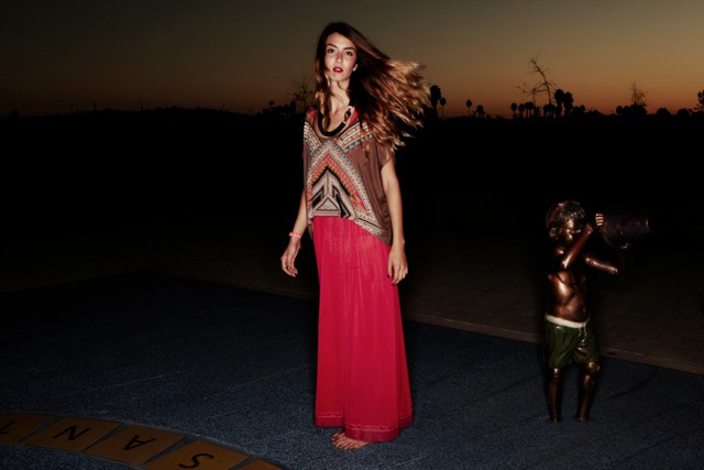
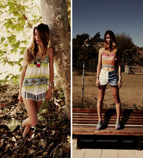
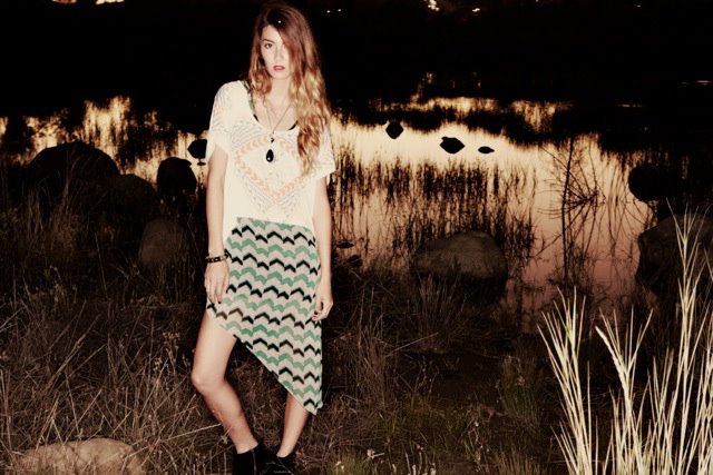
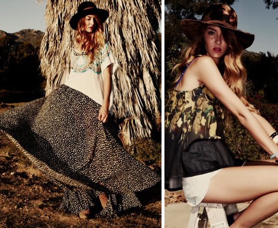
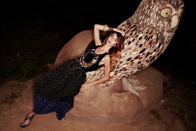
Known for their colorful graphics and distinct, neo-bohemian flair, they’re located in downtown Los Angeles, and they make some of the softest graphic tees around . I love their new Spring ’12 collection; it’s good I have some time to save some money, because I’m going to need one of everything! Be sure to check out their facebook page to see the rest of this collection, find out where to shop, and to keep up with all the latest WkShp news.
Scroll down to read what WkShp’s head merchandiser, Christina Carter, had to say in response to our brand spanking new interview questions.


AW: Where do you like to find inspiration?
WkShp: Vintage textile prints, clothing, and works of art found in places all over the world like Tokyo, Paris, and Sydney inspire the themes and colors for each collection. WkShp’s merchandisers are constantly traveling both globally and locally, gathering ammunition for the art team to begin their creative process.
AW: Who is the WkShp girl?
WkShp: The WkShp girl is confident, bold, and fearless. She knows a great tee can totally transform an outfit! We want each tee to invoke a feeling of complete comfort and ease while simultaneously achieving a trendy, fashion right statement. Cool and effortless.
AW: What is the best type of accessory or item to pair with a WkShp tee or sweatshirt?
WkShp: With our bold prints and bright color palettes, we view our tees as the accessory! We are pairing our tees over maxi dresses and skirts for Fall and Spring; come Summer, we can’t wait to pull out our patterned short shorts for an unexpected print mixed look.
AW: What are your two favorite pieces from the new collection, and why do they stand out?
WkShp: We are obsessed with our new high neck Optic racer tank! The cut is super flattering and perfect for our edgy girl! We are also really loving Geo Inception. The print turned out so fantastic that we had to offer it in two colorways, we couldn’t choose just one! This is the tried and true geometric art with a twist that WkShp has become known for offering.
AW: If you could pick one celebrity to shoot the ad campaign of your dreams, who would it be?
WkShp: Florence Welch from Florence and the Machine. Her style vibe is the perfect mix of feminine and edgy…she always gets it right!
AW: What can we expect to see from WkShp in the near future?
WkShp: We are always experimenting with new silhouettes, so expect to see us delve into other categories such as dresses and bottoms. One day we to hope to expand into a men’s line as well!


(more…)
