Bold, simplified prints are making their back into the runway scene in several of the Resort 2014 collections with these Mod Geos. Get graphic with basic shapes; squares, circles and polygons will be your best friends with this vintage print trend.
Jonathan Saunders
Bringing you a hazy and mellow color story to match my Monday morning mood.
If you’re picking a destination for your 2013 Resort holiday, I highly suggest you follow the lead of these designers and take a trip back in time. Somewhere in the 60’s-70’s would be my choice. Vintage prints, colors and silhouettes are front and center in so many Resort collections that it had to be my first print report of the season. Below are a few of my favorite looks in this trend; I’m particularly loving the ones with bright, contrasting colors!
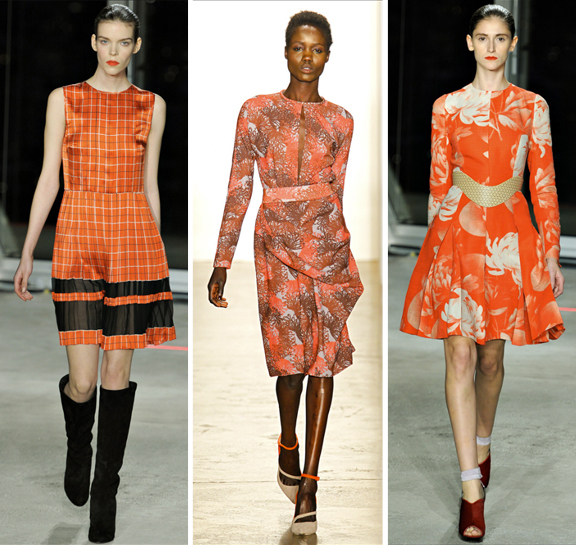
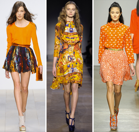
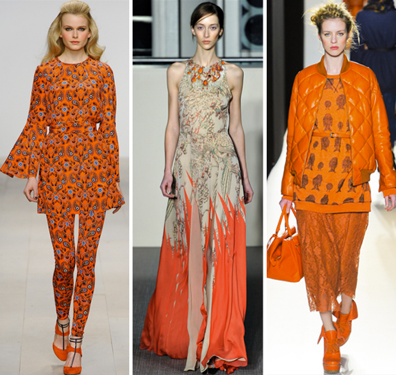
A round up of our favorite prints in the most publicized color of the year: Tangerine Tango. It’s not a bad representation of the season’s top print trends, either… from florals, plaids, and paisleys all the way to Hieronymous Bosch!
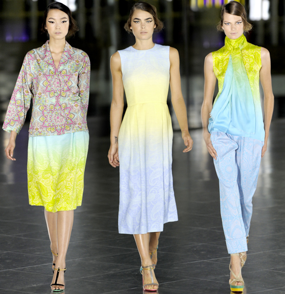
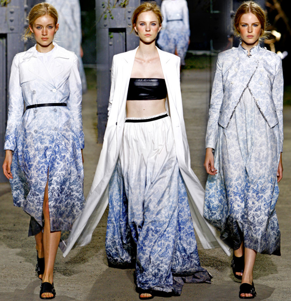
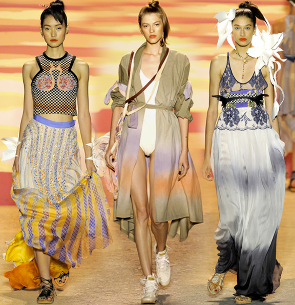
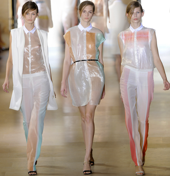
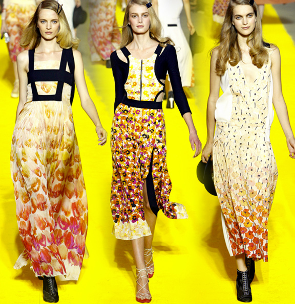
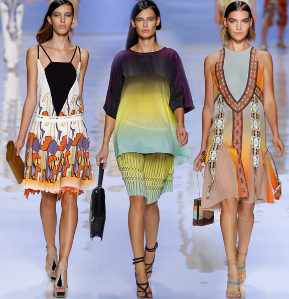
Among the print trends from the Spring 2012 runway shows, the use of ombre´ colors, or gradients, was one of my favorites. There were far too many to picture below, so I focused on a few examples that I thought were especially innovative. It’s great to see how designers are utilizing this colorful technique in such diverse ways, too, ranging from subtle and simple (Saunders, Wauchob) to bold and complex (Etro). A little something for everyone.


