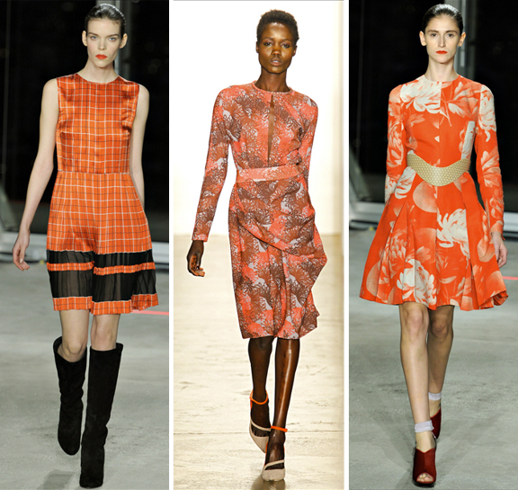
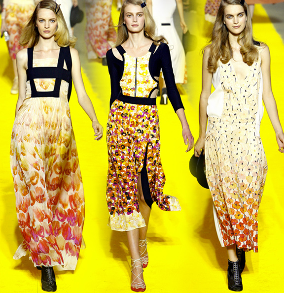
If you’re picking a destination for your 2013 Resort holiday, I highly suggest you follow the lead of these designers and take a trip back in time. Somewhere in the 60’s-70’s would be my choice. Vintage prints, colors and silhouettes are front and center in so many Resort collections that it had to be my first print report of the season. Below are a few of my favorite looks in this trend; I’m particularly loving the ones with bright, contrasting colors!
trends
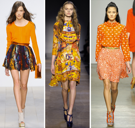
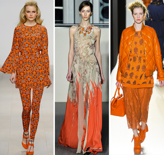
A round up of our favorite prints in the most publicized color of the year: Tangerine Tango. It’s not a bad representation of the season’s top print trends, either… from florals, plaids, and paisleys all the way to Hieronymous Bosch!
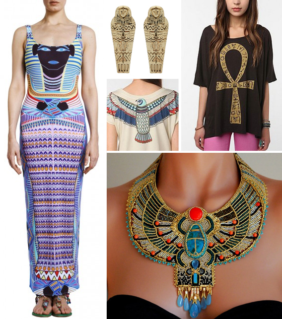
The ornately detailed designs of Ancient Egypt are highly regarded at this art studio, which is why we’d like to see it become a bigger trend. I’ve seen trickles of it here and there for a good while, but nothing near the scope of the tribal trends of the last year or so. The most abundant and popular interpretations seem to be in the form of jewelry, so when Mara Hoffman’s King Tut print became available on bags, swim suits and dresses, we pretty much flipped out. Do you think ancient Egyptian motifs have staying power in surface design? Do you think it would work for interiors? Discuss!
Generally regarded as a sign of sloppiness and low quality [resolution] within the graphic industry, pixilated imagery appears to be pulling it’s weight as a respectable print motif these days. We’ve seen this trend jump from one surface to another in the world of surface design. In fact, it seems to be fairly well represented among fashion, interiors, fine art, and design categories one might mark as ‘other’. My jaw nearly hit the floor when I saw the Pixel Pumps from Mitsubai [pictured below].. I probably wouldn’t wear them much in real life, but I’m now considering planning my next Halloween costume solely around them.
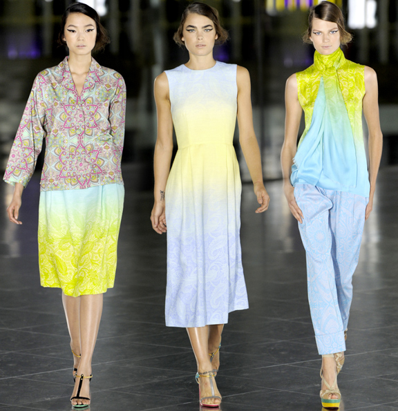
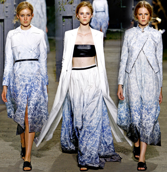
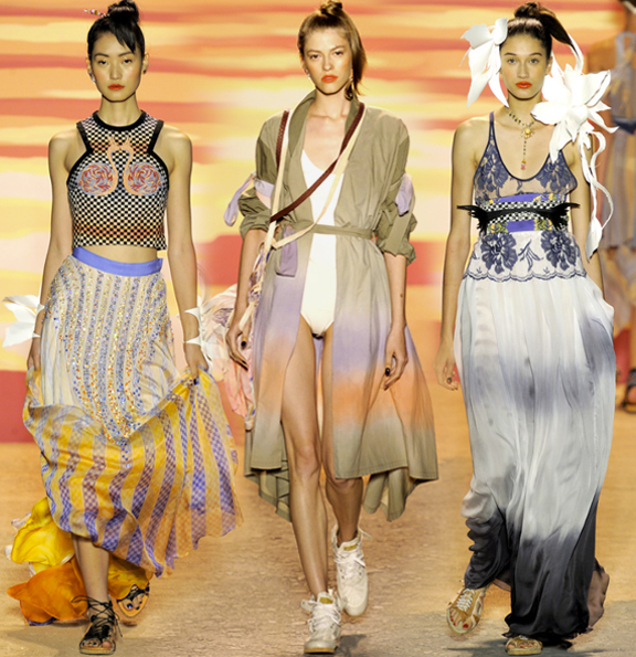
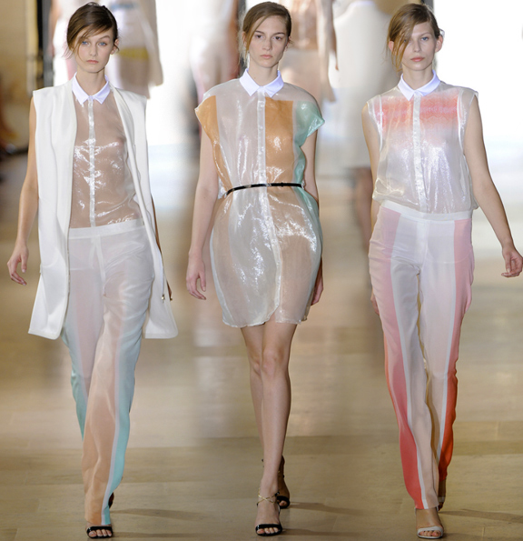
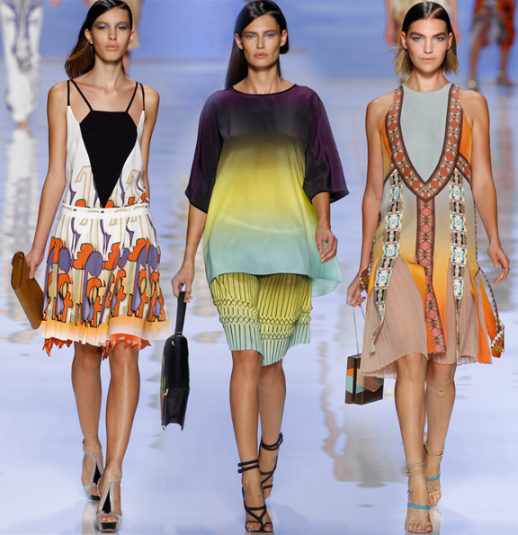
Among the print trends from the Spring 2012 runway shows, the use of ombre´ colors, or gradients, was one of my favorites. There were far too many to picture below, so I focused on a few examples that I thought were especially innovative. It’s great to see how designers are utilizing this colorful technique in such diverse ways, too, ranging from subtle and simple (Saunders, Wauchob) to bold and complex (Etro). A little something for everyone.


